Rick Hulbert
October 2026 - Urban Waterfronts #4
About the Image(s)
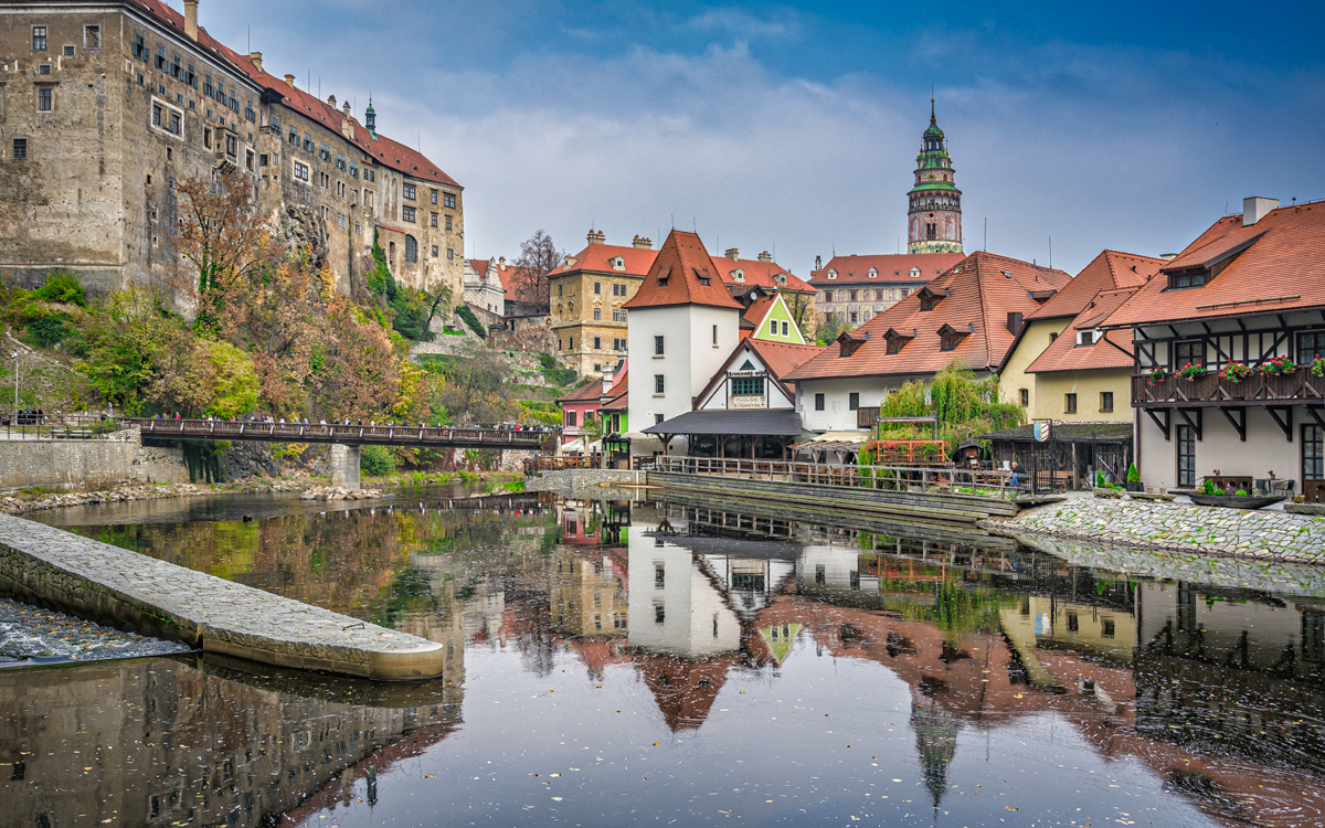
Cesky Krumluv is a lovely heritage town outside of the city of Prague, The Czech Republic. Standing on the edge of the Moldau River, I recorded the submitted image.
It was the reflected water that drew me to the scene. I kept my 35mm lens “dead level” in order to recreate what my eyes and brain were conveying to me.
13 comments posted
Simply a lovely composition to explore, Rick! The white tower, dead center, takes my eye first but then the fun starts. I noticed the old gray building on the left next, perhaps the visual weight, then the stone wharf in the foreground and back around in a circle along the water line. It was only then I noticed the reflection and really noted the tower and where I tended to linger. The colors give such great impact with the contrast of the green, red and blue. On my screen, the upper right seems a bit saturated in blue but I'm always sensitive to that. I often reduce the blue saturation when I dehaze as a result. Posted: 10/07/2026 21:33:19
Hi Michael,
Thanks for your thoughtful and insightful comments.
Much appreciated, Rick Posted: 10/07/2026 22:02:41
Thanks for your thoughtful and insightful comments.
Much appreciated, Rick Posted: 10/07/2026 22:02:41
Rick, what a beautiful scene! Colors and lighting are well done. It would be nice to not have the concrete/stone structure in the bottom left but nothing to do about that. I agree with Michael that the blue saturation could be slightly reduced. Posted: 10/14/2026 21:24:51
Hi Bill,
Thanks for your thoughts.
While I could have removed the "concrete/stone structure" in the bottom left using Generative AI, I wanted the image to be a "photograph" as opposed to a "mixed media" graphic. As you probably know, GenAI invents new pixels never originally recorded.
Posted: 10/14/2026 23:20:57
Rick, I would not recommend removing the structure; the reflection would not be right. Ideally if you could move to the right it might eliminate it but I understand you are at the river's edge. Cropping the left side to remove it might be nice to try but then you would lose the castle and bridge which are important elements in the scene. As another option, if you had the chance, adding a little to the left would allow that structure to connect with the rest of the mainland. As it is now, the river comes to the edge of the image. This seems to isolate the structure from the rest of the land. Does that make sense? Posted: 10/14/2026 23:47:44
Hi Bill,
Thanks . . . I appreciate the clarity of your suggestions.
If I ever find myself in Cesky Krumluv again, I will try to explore your alternatives.
Best, Rick Posted: 10/14/2026 23:53:22
Thanks . . . I appreciate the clarity of your suggestions.
If I ever find myself in Cesky Krumluv again, I will try to explore your alternatives.
Best, Rick Posted: 10/14/2026 23:53:22
Kenneth Taylor
Hello Rick, very good image. I seem to be guided from the red roofs to the tower. Posted: 10/14/2026 23:25:42
Everything in the image is crisp, colorful, and full of detail - the houses, trees, castle, tower, and river all share the stage. Some people might call it "too busy," but I actually feel images like this have their own charm. Modern cameras let us enjoy this richness, and the joy is in taking it all in together or letting your eye wander and choose what to enjoy first.
You're not being guided by the photographer - you're free to explore the frame however you like. It reminds me of how food is served in many Asian traditions: everything arrives at once, vibrant and abundant, and it's up to you to decide what to taste first. In contrast, Western dining often presents dishes one by one in a sequence. This photo feels like that Asian style - generous, and inviting you to experience it in your own order.
There are some lovely reflections in the image, and I'd definitely love to make them stand out more. In fact, I feel the whole scene could use a bit more "pop" - it looks like the colors have been toned down a little. I'd personally cool down the overall palette so everything feels more consistent and the details shine through gently. Posted: 10/16/2026 14:58:18
Thanks Pinaki,
I appreciate your extended analysis of my image. It might be interesting, sometime, to provide an unedited RAW file so that each of us could edit the file as we individually prefer. There would likely be some interesting variations in the results. Posted: 10/16/2026 15:06:19
I appreciate your extended analysis of my image. It might be interesting, sometime, to provide an unedited RAW file so that each of us could edit the file as we individually prefer. There would likely be some interesting variations in the results. Posted: 10/16/2026 15:06:19
While not the focus of the image, the tower brings it together. The green of the tower against the blue sky brings the image to life.
Posted: 10/22/2026 16:17:52
Posted: 10/22/2026 16:17:52
Hi Bruce, You make a very perceptive comment regarding the tower. It also helps to counter balance the large mass of the building on the left of the image. Thanks for your insight. Posted: 10/22/2026 16:43:04
Hi Rick. This is a wonderful image. I agree with Pinaki that there is a lot of detail, but you've rendered the colors muted enough that the detail doesn't shout as noise. Additionally, the composition is very thoughtful which also allows everything to integrate. It can be enjoyed as a whole or one can dive more deeply.
I do not mind the stone "wharf" on the left. I actually think it is integral to the composition. I think the issue is that it is a fairly light tone, surrounded to large degree by darker reflections in the water. So it carries a bit more visually weight than it probably should. I think you could solve that by darkening it a bit - so that it still separates from the building reflections around it but does not pull the eye quite so much.
Posted: 10/28/2026 17:39:08
Hi Robert . . . as always, I appreciate your input. You always see aspects of an image I have failed to consider. Posted: 10/28/2026 18:09:46