Andrew Hersom, APSA, EPSA, EFIAP
October 2026 - Pointsman
About the Image(s)
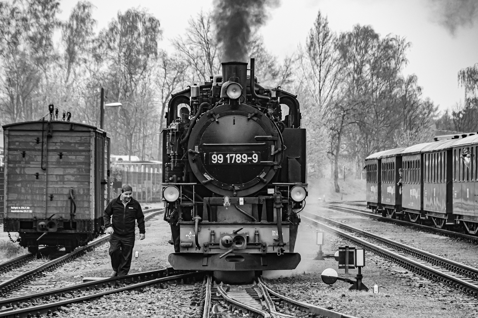
This was shot at a heritage narrow gauge railway in Germany. Unfortunately it was an overcast day. I was able to get right onto the track to take the picture whilst the locomotive was being turned.
I did minimal treatment in post. I thought this image worked better in black and white. Not quite sure of the crop, maybe need to take something off the RHS. What do you think?
6 comments posted
Hi Andrew, I think black and white is a good choice for this image. I think the tones are good. It looks like the locomotive is coming right at me! You have lots of leading lines which lead the viewer from all the edges into the central subject of the locomotive. The man in the left of the photo adds action and movement. The only thing I recommend changing is the boxcar on the left. It's very close to the edge, so I think it'd be better to either add more space to the left of the boxcar if you have it, or crop the left 25% of the boxcar to make it appear intentionally cropped. Posted: 10/01/2026 16:21:25
Hi, Andrew. B&W works well for this image. I wouldn't take anything off the right side as it gives some context. Having an overcast day kept glare off the train and no harsh shadows, so maybe not a bad thing. Posted: 10/02/2026 15:40:52
Very nice image and I agree, B&W was a great choice. The composition is good - the cars on both sides give context and scale. Agree with Janice to maybe add a little space between the car on the left and the edge, but I wouldn't remove it. I think the tonal range and contrast are great - the touch of steam against the black iron is a nice touch. Posted: 10/02/2026 18:38:29
Hey Andrew. As always, good choice with the black and white. The tones are nice and the image is very sharp. I am not sure how I feel about the space, or lack of, on the left. So I made it happen and now we can all see what it looks like with more space. The extra space to me makes the image seem off balance. I did not even bother putting it in On-1 NoNoise as the image is very sharp. Good capture of the gentleman next to the engine. Posted: 10/05/2026 00:31:47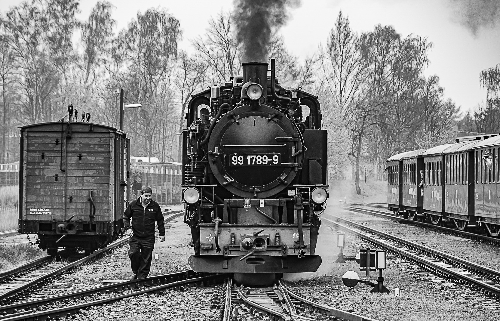
Hi Andrew. As the others have said, B&W is absolutely the correct choice for this image. You have caught the items and exposed well considering the overcast conditions. It is a pity there is not a bit more steam coming from the top as it sort of looks a bit chopped off. I would take a tiny bit off the left side as the box car is not straight. Cropping to the edge of it may help with the visuals. I would also play with cropping on the right side. I would try removing that structure altogether, cropping so that the white part of the signal thing on the ground was still in frame. You may need to clone out other bits higher up on the new edge. I would then clone out the white part of the signals plus its upright post, just leaving the black square signal and the round one too. This then shifts the focus to the man who, to my eye, becomes more interesting. Posted: 10/21/2026 01:15:43
Hi, Andrew,
I like this photo a lot. The picture is very sharp, the locomotive is beautifully facing front with the tracks and a man walking by it. Love the action, good choice for a B/W photo.
If I were to edit this picture, I probably would leave the box car out, as it seems distracting from the main focus: the man and the locomotive. I'd also crop some from the right hand side. Posted: 10/22/2026 18:26:23