Elena Rumyantseva
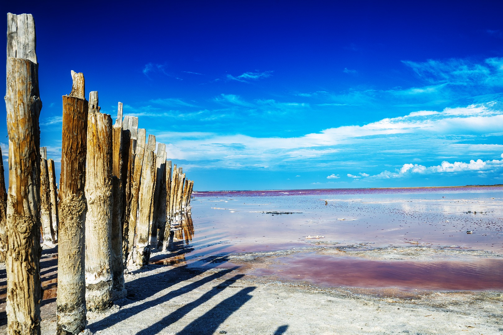
October 2026 - Sasyk-Sivash. Salt Lake.
About the Image(s)
Location: Crimea, Russia.
Year: 2026.
This is a salt lake where the colour of the water is not an effect or a filter, but a trace of salt and microorganisms. The pink hue changes with the season and the light. A row of old wooden piles recedes into the distance, setting the rhythm and perspective. Long shadows on the salt work as a graphic foreground, holding the composition together.
What mattered to me was not to show a "beautiful place", but a state of space: the contrast between the warm texture of the wood, the cold blue of the sky, and the pink water that looks almost unreal ??” yet remains part of a natural process.
8 comments posted
I don't know if this area is easily accessible for you, but I think if you could return time and again under various conditions this would make an interesting series to showcase those changes in the waters hue. Posted: 10/01/2026 18:57:56
Thank you, Russell. You're absolutely right - the pink hue shifts depending on the season and the salt concentration, so a series could show something much deeper than a single image. I live far from Crimea, so I can't visit often, but I'm thinking about how to capture that change over time, even if it's not this exact location. I like the idea of the lake as a "living" subject, not a static one. Posted: 10/06/2026 10:04:55
Nice composition. Texture of the wood contrast with sky and water. I love the blue gradation of the sky. Posted: 10/07/2026 11:27:47
Thank you, Arief! I also love how the texture of the wood plays against the cold blue of the sky - that contrast is what holds the whole frame together. Glad you noticed it. Posted: 10/16/2026 06:10:54
I looked at this for a while and wondered what it was that that annoying me. Took me a while to working it out. First I thought that the Sky was over saturated, but you can get it that blue. The water colour is wonderful. SO then the horizon which is running slightly uphill. But then it hit me. Its that post on the left. If you look at the image everything throws you off into the water and that wonderful view, but that one post is large, goes skyward and is out of focus. Removing it makes for a much softer image. Wonderful place for a series of images. Posted: 10/11/2026 09:26:52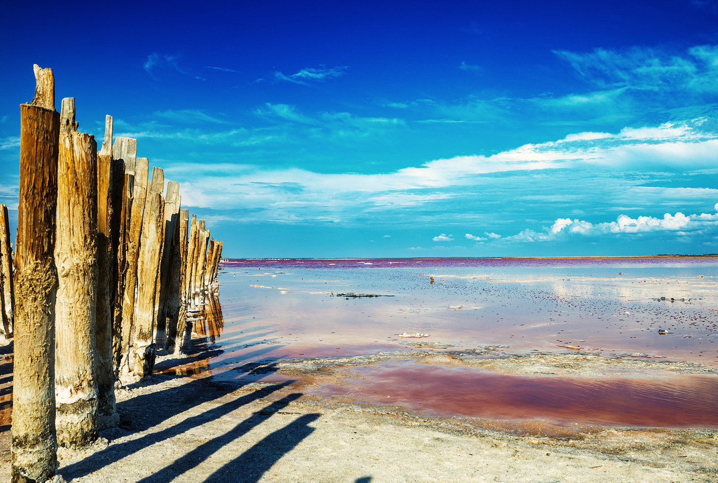
Paul, thank you for such a thoughtful breakdown - that's valuable. You're right: the left post does stand out. I thought of it as an anchor for the foreground, but now I see it draws attention rather than holding the composition. I'll try removing it and see how the feeling changes. Thank you for the idea and for taking the time to work out what exactly was bothering you. Posted: 10/16/2026 06:11:25
New here , so just jumping in . The image is lovely with the blue skies and the pink hue. What a find! I might crop a tiny bit off that blue sky ( although it is an amazing blue ) and maybe try taking out the first post on the left ? Love the composition and the way your eye follows the textured wood and then the pink hue in the water . What a beauty ! Posted: 10/15/2026 15:37:03
Lori, thank you for jumping in! It's lovely to hear that. You and Paul both pointed to the same thing - the left post really does ask to be removed. Now I'll definitely try it. And about the sky - that's an interesting thought: perhaps a slight crop would make the frame feel more contained. Thank you for the ideas and for the warm feedback! Posted: 10/16/2026 06:12:18