Sabine Nehls, QPSA, EFIAP
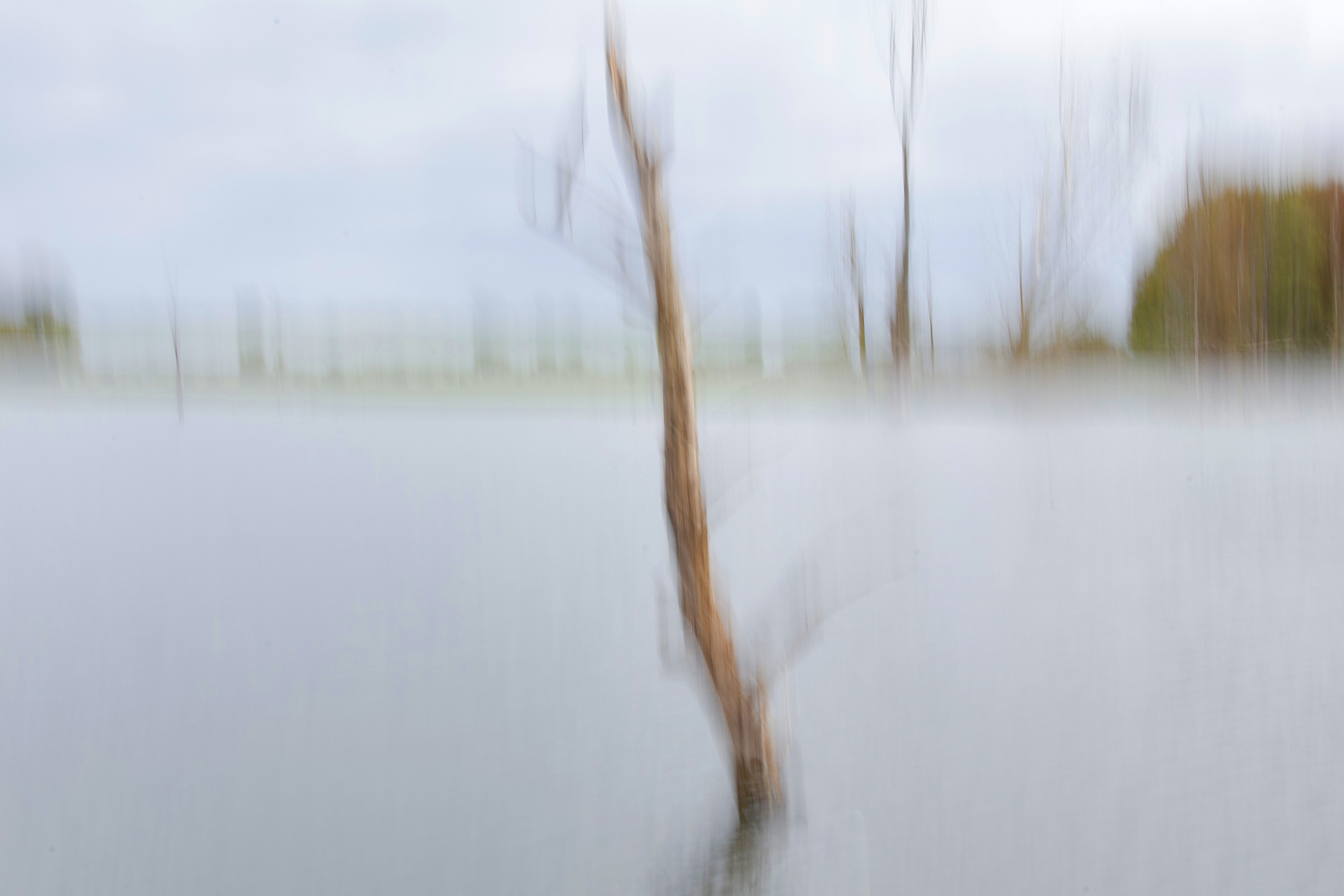
October 2026 - Lonely Tree
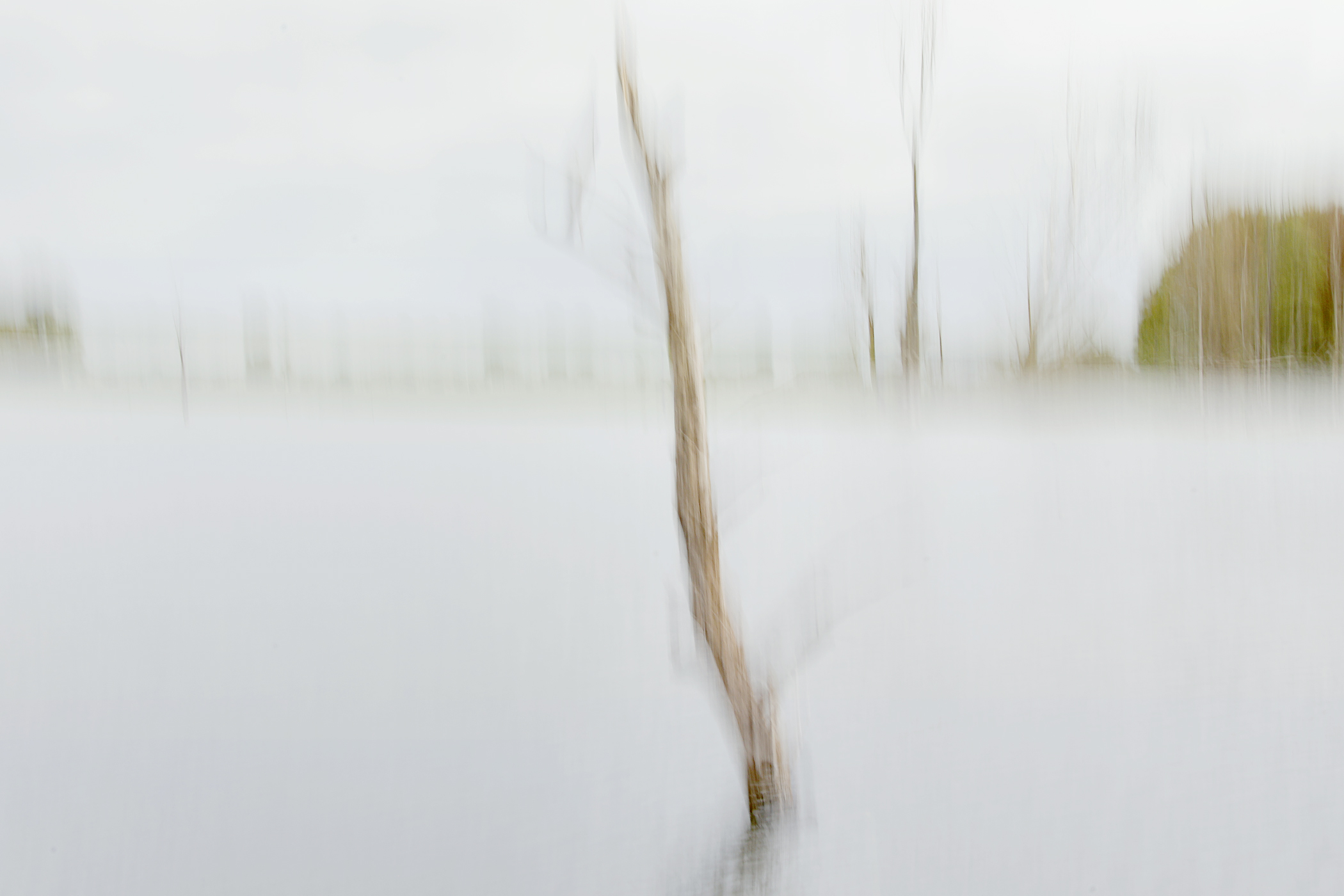
Original
About the Image(s)
Bislicher Island is a nature reserve where you can spot spoonbills, kingfishers, and many other birds. It was very quiet that day, so I practiced ICM once again. My main subject was a tree trunk protruding from the water. After many attempts to pan the camera upward, I finally got a good photo. “Original 1” was my first version of the edit, and “Lonely Tree” was my second version. While “Original 1” reflects the atmosphere I found there, “Lonely Tree” has more saturated colors.
I’d love to hear your thoughts on the two images. Which one do you like better? Of course, I’d also appreciate any suggestions for improvement.
Canon EOS R10, 35mm, f/29, 1/6 sec, ISO 100
21 comments posted
So interesting to see the effect you generated. An impressionistic approach to the subject and well-framed and cropped. I admit to being indifferent between the two photos - yes - more color in the second one but I'm partial to the muted tones of the first as well. Not sure it needed saturation.
Thank you! Posted: 10/04/2026 11:20:29
Thank you! Posted: 10/04/2026 11:20:29
Douglas, thank you so much for your thoughts. As I already mentioned, I like both pictures. I think atmosphere plays a big role here. At the moment, with the drizzly autumn weather we're having here in Germany, I'm leaning more towards the original. Posted: 10/12/2026 07:13:35
Sabine,
I tend to prefer bolder images so I like the enhanced saturation of your final version. In fact, just to see what it could be, I tweaked it even further. I can't say it's an improvement but it's definitely a more dramatic look. Posted: 10/04/2026 18:23:19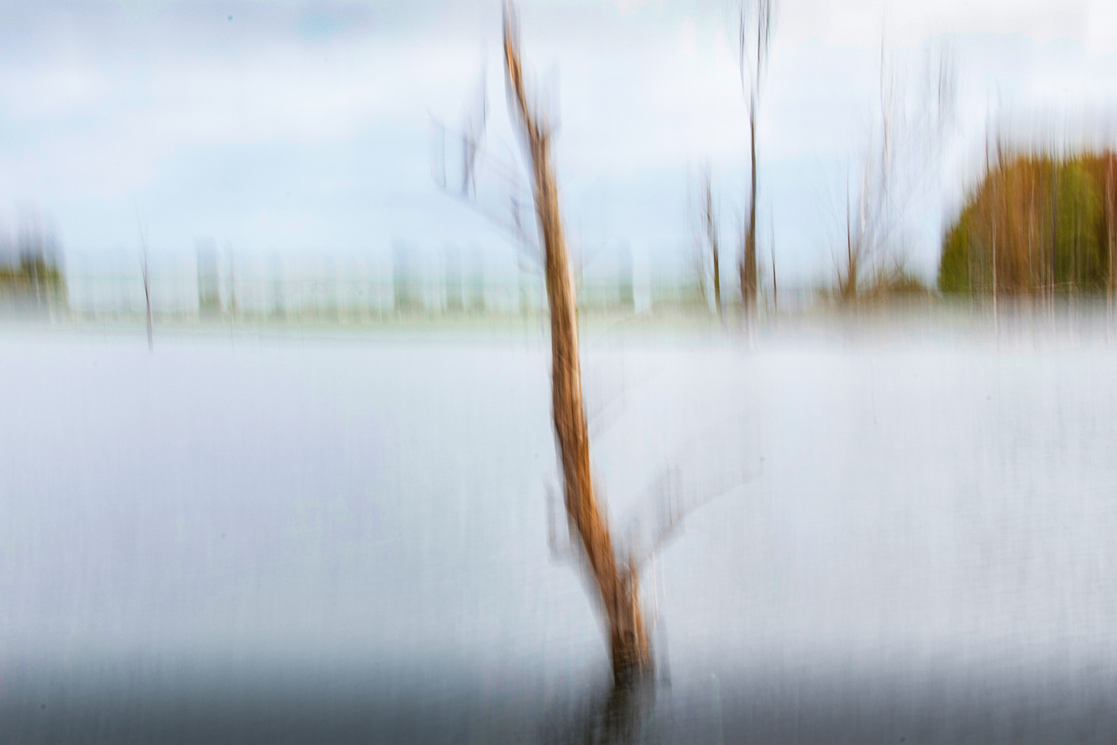
I tend to prefer bolder images so I like the enhanced saturation of your final version. In fact, just to see what it could be, I tweaked it even further. I can't say it's an improvement but it's definitely a more dramatic look. Posted: 10/04/2026 18:23:19
Bruce, thank you so much for your idea of ??a more dramatic edit. Some "details" are even more visible now. Was the dark stripe at the bottom created by increased color saturation, or did you use a vignette? Posted: 10/12/2026 07:20:21
The dark area at the bottom is just a vignette created with a linear gradient in Lightroom. In hindsight, I wish I had softened it a bit. Sometimes you don't see those things until you look back. Posted: 10/12/2026 16:13:40
Thank you very much, Bruce, for your reply. Posted: 10/12/2026 17:24:12
Hi Sabine,
Very interesting subject and great for fall. I don't have a big opinion between the original and the one you presented. I did wonder how it would looked cropped off center.
I cropped in old software that has an 'I'm feeling lucky' button and added that.
I think I prefer the off center crop, but I feel like the more saturated color gives another option rather than a clear winner. Posted: 10/04/2026 22:49:32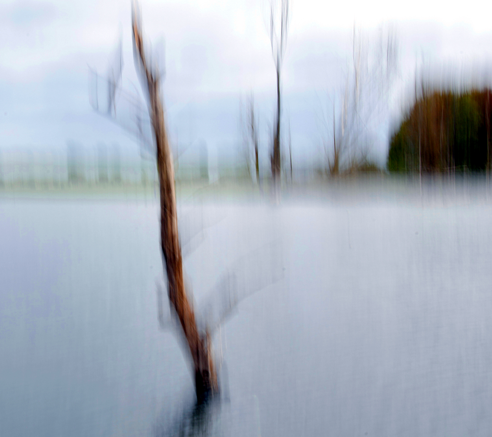
Very interesting subject and great for fall. I don't have a big opinion between the original and the one you presented. I did wonder how it would looked cropped off center.
I cropped in old software that has an 'I'm feeling lucky' button and added that.
I think I prefer the off center crop, but I feel like the more saturated color gives another option rather than a clear winner. Posted: 10/04/2026 22:49:32
Thank you, Sylvia, for your thoughts and your editing. I find your cropping interesting. I hadn't even considered not placing the trunk in the center. Sometimes, after all, you see something and want to capture exactly that in the edited image.
That's why I really appreciate our group. Thinking outside the box - that's a German proverb. Posted: 10/12/2026 07:30:10
That's why I really appreciate our group. Thinking outside the box - that's a German proverb. Posted: 10/12/2026 07:30:10
Nice job, Sabine. I prefer the "Lonely Tree". It is saturated perfectly. The image emits a calm, solitary mood. I prefer an off center crop as Sylvia has suggested. You captured a great image. I found that ICM is a helpful technique on a windy day. Posted: 10/05/2026 13:16:47
Thank you very much, Barbara, for describing the mood so accurately. The image "Lonely Tree" was meant to convey a sense of calm, and I think I succeeded in doing that, even though the colors are more saturated. You prefer Sylvia's cropping. Could you give me a brief explanation for that? It would be very helpful to me. Posted: 10/12/2026 07:39:16
Sabine,
I prefer the subject(tree) to be off center in the frame. Posted: 10/12/2026 13:39:15
I prefer the subject(tree) to be off center in the frame. Posted: 10/12/2026 13:39:15
Thanks. Posted: 10/12/2026 17:25:00
Hi Sabine, I initially liked the second version of Lonely Tree. The saturated colors added an unsettling edge to the atmosphere. However after another study the original version has an ethereal quality. The blurred background adds to the quietness of the scene. For a serene scene I favor the original. Posted: 10/09/2026 19:45:16
Yvonne, thank you for your thoughts and for taking the time to look at the two photos so closely.
The effect the photo "Lonely Tree" has on you is interesting. Disturbing? Eerie?
Perhaps I didn't translate it correctly. Could you write me a few sentences about it so I can understand exactly where that feeling comes from? That will help me with other projects.
If this request is too personal, I understand-just forget about it. Posted: 10/12/2026 07:51:36
Not too personal at all. I meant eerie as a foreboding sign. A silence before the storm. The color of the saturated house adds to this. Seems like the ICM blurring combined with color saturation created a ghostly feeling. In my eyes you created a successful composition with ICM as both images elicit emotions. Posted: 10/12/2026 12:40:59
Thank you very much for your reply. Now I can understand how your photo made you feel. I find it very interesting how differently these colors can be perceived.
I rarely think about that when editing photos. In any case, I'll keep it in mind. Posted: 10/12/2026 12:57:44
I rarely think about that when editing photos. In any case, I'll keep it in mind. Posted: 10/12/2026 12:57:44
It is interesting to hear different interpretations on the same composition. It'll be pretty hard to determine before hand how your composition will be interpreted since art is relative. However if you are going for a certain mood showing it to a few folks... like our group helps. Posted: 10/12/2026 13:11:30
That's why I really appreciate our group discussions.
Sometimes things only become clear to me after reading the comments. Posted: 10/12/2026 17:28:01
Sometimes things only become clear to me after reading the comments. Posted: 10/12/2026 17:28:01
Yes, things you never would have considered. Posted: 10/12/2026 17:45:53
Sabine, I think of the two versions, I prefer the Lonely Tree version. I think the boost of color and contrast adds to the image. I have never tried this technique, so I don't have any helpful suggestions. Though I like Sylvia's suggestion to crop the left side a bit so the tree is off center. Posted: 10/11/2026 19:20:27
Randy, thank you so much for your comments. Since you also prefer Sylvia's crop, I finally see the difference. My Lonely Tree divides the image in two. A tighter crop guides the viewer's eye better. Posted: 10/12/2026 07:59:39